Animated Logo for banners, web, and tap house displays.
Project Scope
The project objective was to build a comprehensive identity system for a hard kombucha company that visually conveys the physical properties of kombucha as being unique, effervescent, and natural. Building out a variety of branded touchpoints was also necessary for positioning the brand against competitors.
However, our brand should reach a larger audience if the product's packaging visually appeals to demographics that follow various trending diets, such as paleo, reduced-sugar, organic, vegan, gluten-free, keto, and sulfite-free diets.
However, our brand should reach a larger audience if the product's packaging visually appeals to demographics that follow various trending diets, such as paleo, reduced-sugar, organic, vegan, gluten-free, keto, and sulfite-free diets.
Taphouse Hosted Community Event Posters
Company Mission
Coalesce Kombucha Company's mission is to create a healthier alcoholic drink that re-establishes social inclusivity for people who often have fewer alcoholic options when going out. Additionally, the brewing company will serve as a taproom and event venue to further instill the social unity initiative.
Coalesce is a hard kombucha brewery, taproom, and packaging distributor located in Austin, TX. It was essential to identify the core demographic of potential customers before designing the system. Research and local survey results suggested that the core demographic comprised mostly female adults, 21-30 years old, either receiving a degree in higher education or having finished a degree or program of study.
Typography from Package Design Touchpoint
Animated Package Design Touchpoints. Rotating to display full design.
Seasonal Hard Kombucha Menu List
Implementation
The implementation of the design system includes comprehensive touchpoints for the taphouse and package design assets. Each design was produced to communicate to the audience what Coalesce Kombucha Company is, brand message, and establish brand recognition.
Concept-Driven Design
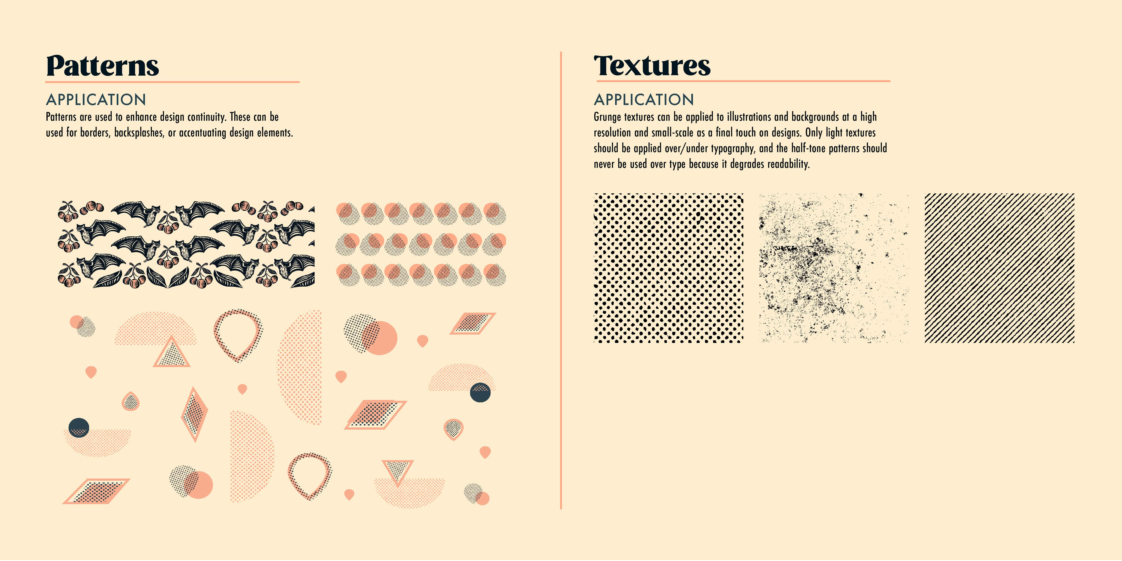
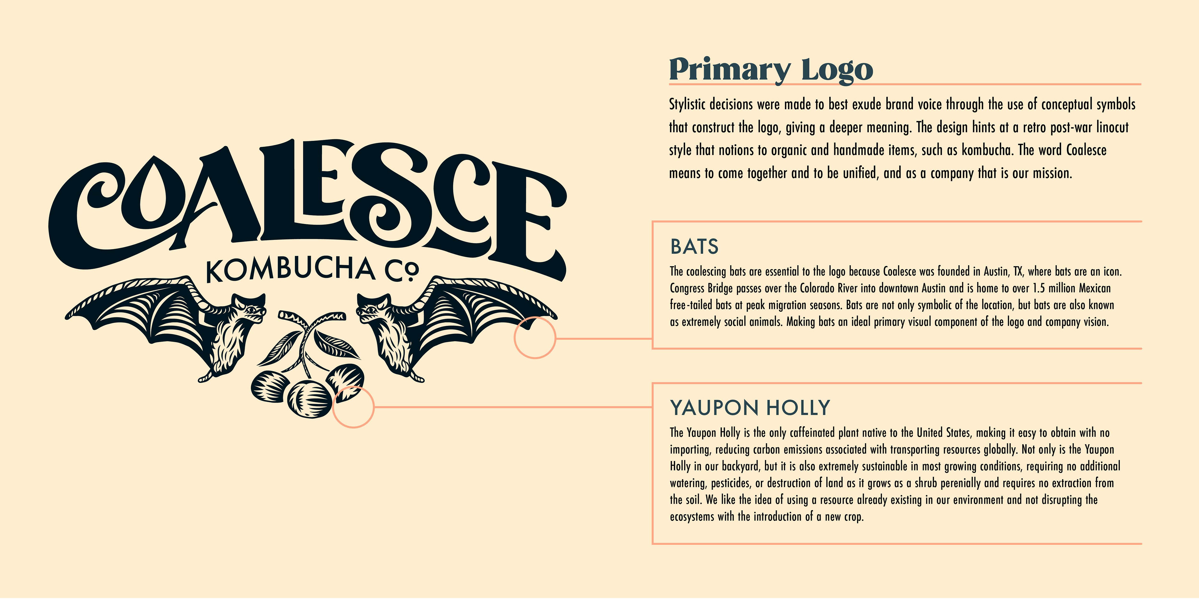
The visual design suggests an organic nature that acknowledges the fermentation process of kombucha, which is produced in small batches by hand, using raw ingredients through a natural process. Kombucha is a living drink consisting of billions of probiotics, also known as colonies of bacteria. Bats, like kombucha, exist in large colonies and are an incredibly social animal and a powerful icon to Austin, TX. Using bats as a symbol to unify the idea of living kombucha colonies with bat colonies further instills Coalesce's investment in social infrastructure. The color palette implements color psychology to improve brand perception further, with primary colors of peach and dark teal. Peach is known to evoke feelings of sociability, and teal was suggested to emit sensations of calm.
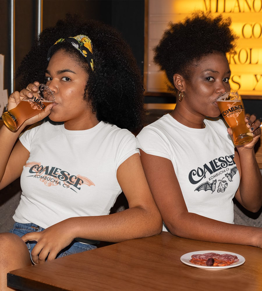
T-shirt Designs
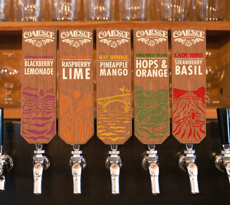
Linocut Styled Tap Heads
Menuboard Animation
Storefront Signage
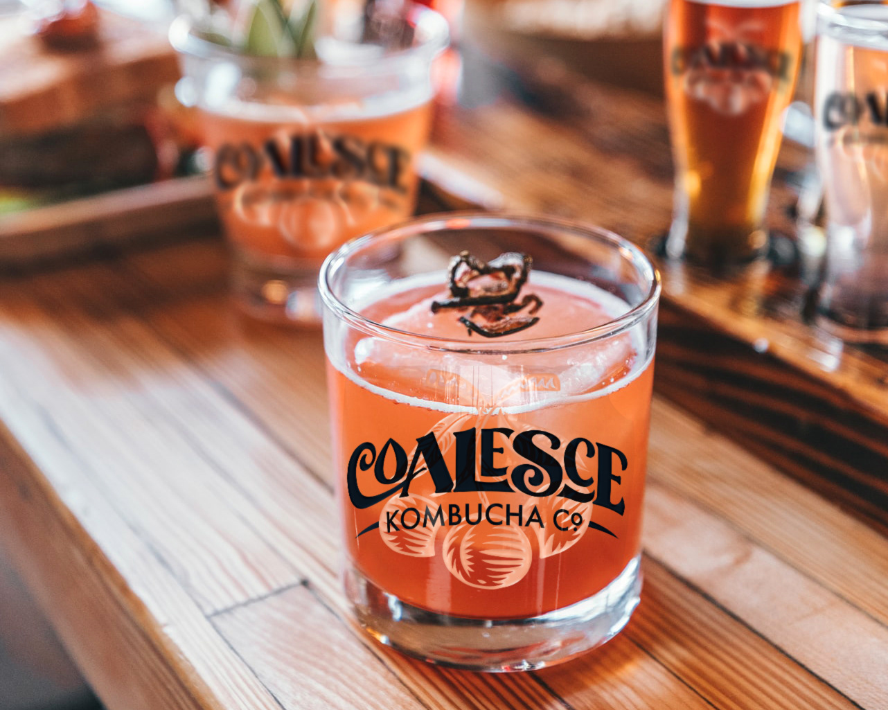
Glass Design
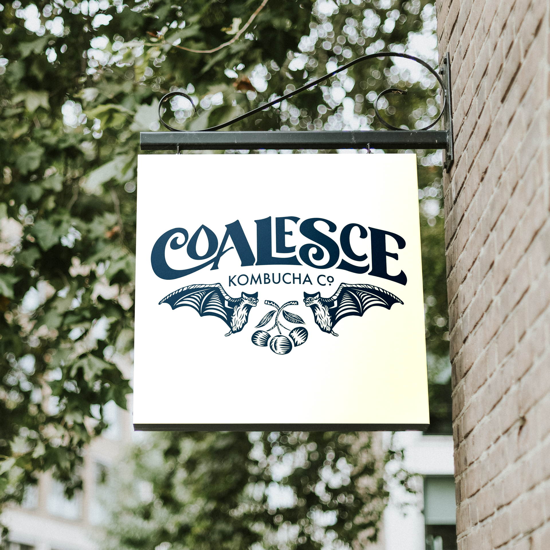
Corner Signage
Identity System
Click on images to view at full-size
Click on images to view at full-size
